Color influences how people experience spaces, objects, and visual communication. Whether used in interior design, branding, art, or digital media, the distinction between warm colors and cool colors plays a central role in how environments are perceived. In homes and workspaces across the UK and USA, color choices are often guided by emotional response, light conditions, and practical function rather than decoration alone.
Table of Contents
ToggleUnderstanding what are warm colors, what are cool colors, and how cool colors vs warm colors interact allows for more balanced and intentional design decisions. This article explores these color groups in depth, explaining their characteristics, effects, and practical applications without focusing on trends or promotional advice.
What Are Warm Colors
Warm colors are hues that are commonly associated with warmth, sunlight, and fire. These colors tend to advance visually, meaning they appear closer to the viewer. Because of this quality, they are often used to create a sense of energy, comfort, or intimacy.
Common warm colors include:
-
Red
-
Orange
-
Yellow
-
Variations such as coral, terracotta, and amber
When asking what are warm colors, the answer goes beyond naming hues. Warm colors are defined by their position on the color wheel and their psychological associations.
What Are Cool Colors
Cool colors are typically linked with water, sky, and shade. They recede visually, creating a sense of distance or openness. This makes them effective for calming environments or for making spaces feel larger.
Examples of cool colors include:
-
Blue
-
Green
-
Purple
-
Tones such as teal, mint, and lavender
When people ask what colors are cool colors, they are usually referring to these hues and their softer variations. Cool colors are often used in settings where calm, focus, or relaxation is desired.
Warm Colors and Cool Colors on the Color Wheel
The traditional color wheel helps explain warm vs cool colors visually. Warm colors occupy one side of the wheel, while cool colors sit opposite them. This separation highlights how these color families contrast and complement one another.
The color wheel concept is widely referenced in design education and is supported by organisations such as Pantone, which categorises colors based on hue, saturation, and temperature.
Understanding the color wheel allows designers to predict how warm colors vs cool colors will interact in a space or composition.
Cool Colors vs Warm Colors: Visual Perception
The difference between cool colors versus warm colors is not just theoretical. It directly affects how people perceive size, distance, and balance.
-
Warm colors tend to feel closer and more enclosed
-
Cool colors feel farther away and more open
For example, a room painted in warm shades may feel smaller but more inviting, while the same room in cool tones may appear more spacious and airy.
This visual behaviour explains why cool colors vs warm colors are used strategically in architecture and interior planning.
Psychological Associations of Warm Colors
Warm colors are often linked to stimulation and activity. Red can suggest intensity or urgency, while orange and yellow are associated with optimism and warmth.
In residential settings, warm colors are commonly used in:
-
Living rooms
-
Dining areas
-
Social spaces
However, too much warmth can feel overwhelming if not balanced. This is why understanding warm colors and cool colors together is important rather than using one category in isolation.
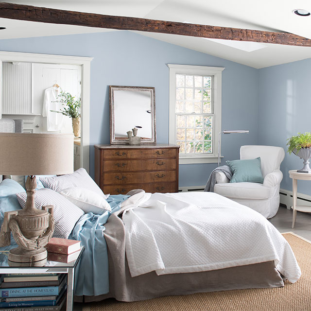
Psychological Associations of Cool Colors
Cool colors are typically associated with calmness and clarity. Blue is often linked to trust and stability, while green suggests balance and renewal.
Cool colors are frequently chosen for:
-
Bedrooms
-
Bathrooms
-
Offices and study areas
When applied thoughtfully, cool colors help reduce visual noise and create restful environments. This is why many people researching what are cool colors are looking for ways to create a calmer atmosphere.
Warm Color Palette and Its Characteristics
A warm color palette includes a selection of warm hues that work together harmoniously. These palettes often rely on variations of red, orange, and yellow, adjusted through tint and shade.
Warm palettes tend to:
-
Feel energetic and welcoming
-
Draw attention to focal points
-
Work well in spaces with limited natural light
In UK homes with cooler climates, warm palettes are often used to offset grey weather and shorter daylight hours.
Cool Color Palettes and Their Use
Cool color palettes focus on blues, greens, and purples. These palettes often feel lighter and more subdued.
Cool palettes are effective when:
-
Natural light is abundant
-
A sense of calm is desired
-
Visual expansion of space is needed
This explains why cool colors are popular in coastal design themes and modern interiors.
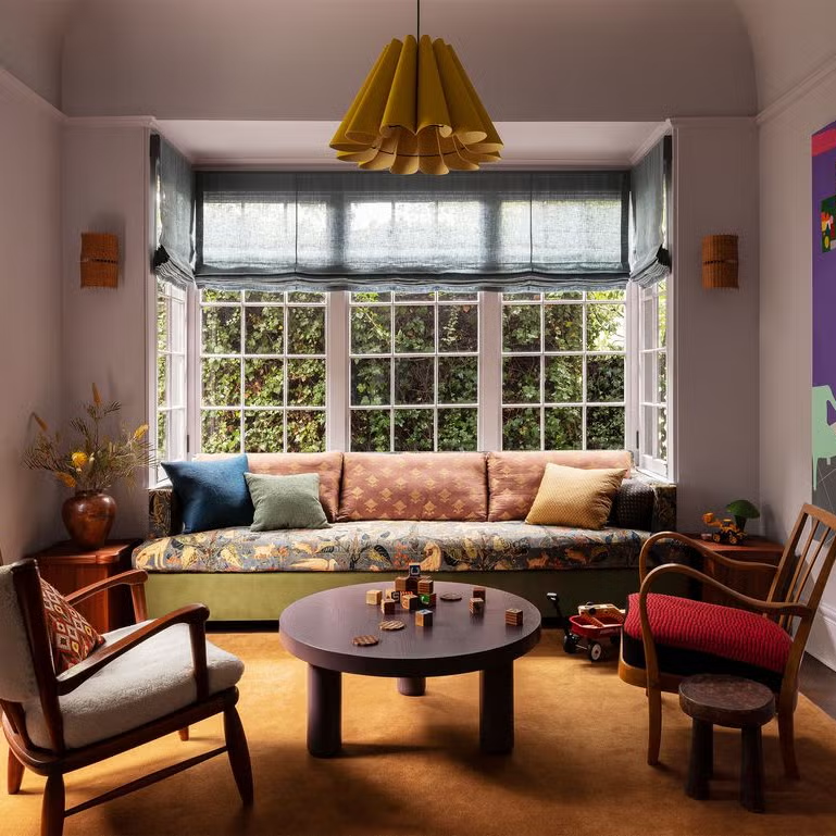
Warm Colors vs Cool Colors in Interior Design
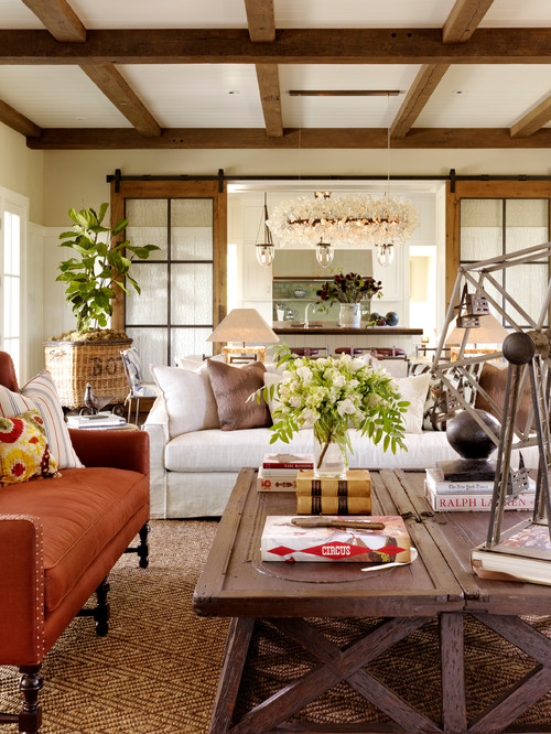

In interior design, warm vs cool colors are rarely used in isolation. Most spaces combine both to achieve balance.
For example:
-
Warm walls paired with cool furnishings
-
Cool backgrounds accented with warm decor
-
Neutral bases enhanced by both color types
Understanding warm colors vs cool colors helps avoid overly flat or visually tiring spaces.
Lighting and Color Temperature
Lighting strongly influences how cool colors and warm colors appear. Artificial lighting has its own color temperature, measured in Kelvin.
-
Warm lighting enhances reds and yellows
-
Cool lighting enhances blues and greens
This interaction means a color that appears warm in daylight may look cooler under artificial lighting. Designers consider this carefully when selecting color schemes.
Cool Colors Versus Warm Colors in Visual Media
In photography, film, and digital design, cool colors versus warm colors are used to convey mood and narrative.
-
Warm tones often signal intimacy or energy
-
Cool tones suggest distance, calm, or seriousness
This contrast helps guide emotional response without using words.
What Colors Are Cool Colors in Practical Terms
In practice, what colors are cool colors depends on undertone. Some colors can appear warm or cool depending on how they are mixed.
For example:
-
A blue with green undertones feels cooler
-
A blue with red undertones feels warmer
This subtlety explains why not all blues or greens feel the same.
Neutral Colors and Temperature Balance
Neutral colors such as grey, beige, and white also have temperature. A grey with blue undertones feels cool, while one with brown undertones feels warm.
Balancing neutrals with warm colors and cool colors helps maintain cohesion in design schemes.
Cultural and Regional Influences
Color perception can vary by culture and environment. In warmer regions of the USA, cool colors are often used to create visual relief. In cooler regions of the UK, warm tones may be favoured for comfort.
Despite these variations, the fundamental principles of cool colors vs warm colors remain consistent.
Warm Colors and Cool Colors in Branding
Brands use color temperature strategically to influence perception. Warm colors often signal energy or accessibility, while cool colors suggest professionalism or trust.
This approach aligns with long-standing color theory principles studied in design disciplines and supported by publications such as Interaction of Color, which explores how color relationships affect perception.
Balance Between Warm and Cool Colors
Effective design relies on balance. Too many warm tones can feel heavy, while excessive cool tones may feel distant.
A balanced approach often includes:
-
A dominant color temperature
-
A secondary contrasting temperature
-
Neutral tones to connect both
This structure applies to interiors, graphics, and even fashion.
Common Misunderstandings About Color Temperature
One common misconception is that warm colors are always bright and cool colors are always muted. In reality, both categories include a wide range of intensities.
Another misunderstanding is treating color temperature as fixed. Many hues shift between warm and cool depending on context.
Understanding these nuances improves the use of warm vs cool colors in real-world settings.
Cool Colors vs Warm Colors in Small Spaces
In smaller spaces, cool colors often help create a sense of openness. Warm accents can then be added to prevent the space from feeling impersonal.
This strategy is frequently used in apartments and compact homes across the UK and USA.
Seasonal Associations of Color
Warm colors are commonly associated with autumn and summer, while cool colors are linked to winter and spring. These associations influence how spaces feel throughout the year.
Rotating accessories rather than repainting allows homeowners to adjust the balance of warm colors vs cool colors seasonally.
Long-Term Use of Warm and Cool Colors
From a long-term perspective, neutral bases combined with adjustable warm and cool accents offer flexibility. This approach reduces the need for major changes while keeping spaces visually engaging.
Understanding cool colors versus warm colors supports sustainable design decisions that adapt over time.
Conclusion
The relationship between warm colors and cool colors shapes how environments are experienced. By understanding what are warm colors, what are cool colors, and how cool colors vs warm colors interact, it becomes easier to create balanced, functional, and visually comfortable spaces.
Rather than choosing one category exclusively, thoughtful combination and awareness of context allow both warm and cool tones to work together effectively in homes, workplaces, and visual media across the UK and USA.