Among all the hues in the color spectrum, purple has long been associated with creativity, depth, and sophistication. From royal robes to contemporary interiors, this color continues to evoke mystery and elegance. But to truly make purple shine — whether in fashion, design, or decor — it needs the right companion shades.
Understanding colors that complement purple isn’t just a matter of taste; it’s also about color theory, mood, and balance. In both the UK and USA, purple has become a favourite for modern home styling, digital aesthetics, and brand identity. But with its many shades — from deep violet to soft lavender — the question remains: what colors go best with purple?
This article explores how to pair purple effectively, examining its complementary, analogous, and contrasting tones, as well as how to use it in home decor, fashion, and art.
The Meaning and Psychology of Purple
Before pairing colors, it helps to understand what purple represents. Formed by mixing blue and red, purple carries the calmness of blue and the energy of red, creating a balance between cool and warm tones.
Symbolism of Purple:
-
Royalty and Luxury: Historically linked to kings and queens due to the rarity of purple dyes.
-
Creativity and Imagination: Often used in art and branding to represent innovation.
-
Mystery and Spirituality: Associated with introspection, meditation, and the metaphysical.
-
Romance and Femininity: Lighter shades like lilac and lavender evoke tenderness and grace.
Understanding these associations helps guide how and where to use purple effectively.
Shades of Purple and Their Personalities
Not all purples are created equal. The tone or saturation of purple influences which colors will complement it best.
1. Deep Purple and Eggplant
Rich, dark tones such as eggplant or aubergine convey luxury and depth. These pair beautifully with neutrals and metallics.
2. Violet and Amethyst
Vivid shades that lean toward blue; they work well with cooler tones like silver, teal, and white.
3. Lavender and Lilac
Soft, pastel purples that create a calm and romantic atmosphere. Ideal companions include beige, soft pink, or mint green.
4. Mauve and Plum
Earthier tones of purple that complement natural palettes like olive green, cream, and terracotta.
When exploring colors that go well with purple, it’s essential to match not just hue but mood.
The Opposite of Purple on the Color Wheel
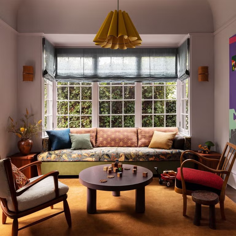
In color theory, every hue has an opposite — a color that creates contrast and vibrancy when paired together. The opposite of purple on the color wheel is yellow.
This relationship is known as complementary contrast. When purple and yellow are combined, they amplify each other’s intensity, producing a striking and energetic visual balance.
Examples:
-
Violet + Mustard: Adds warmth and retro flair.
-
Lavender + Pale Yellow: Perfect for spring-inspired interiors.
-
Deep Plum + Gold: Creates a regal, dramatic atmosphere.
This pairing appears frequently in art, fashion, and interior design, showcasing how opposite colors can coexist harmoniously.
Colors That Go Well With Purple
Depending on whether the desired effect is bold, subtle, modern, or traditional, purple can be paired with a variety of tones. Below are some combinations that consistently complement this versatile color.
1. Neutrals: White, Gray, and Black
Neutrals provide balance and structure when paired with purple, preventing it from feeling overwhelming.
-
White: Crisp and clean, white highlights the brightness of purple. A purple wallpaper against white trim or furniture creates a refined look.
-
Gray: A popular choice for modern interiors in the UK and USA, gray tones soften purple without dulling its character. Light gray complements lilac, while charcoal enriches deep plum.
-
Black: When used sparingly, black enhances drama and sophistication, particularly with metallic or jewel-toned purples.
This combination is frequently seen in minimalist or contemporary design, providing depth while maintaining simplicity.
2. Metallics: Gold, Silver, and Bronze
Purple and metallics have been an iconic duo since antiquity. The shimmering quality of metal complements purple’s opulence, producing timeless elegance.
-
Gold: Symbolizes wealth and luxury. When paired with deep purples, gold creates a royal and classic aesthetic.
-
Silver: Works beautifully with lavender or violet, offering a cool, futuristic contrast.
-
Bronze or Copper: Adds warmth and a rustic edge, ideal for plum or mauve-based color schemes.
These combinations often appear in interior decor, particularly in accent pieces, frames, or curtain rods paired with purple wallpaper.
3. Greens: Olive, Sage, and Emerald
Since green is adjacent to purple on the color wheel’s opposite side, the contrast is natural yet harmonious.
-
Olive and Sage: Soft greens bring balance to warm purples like mauve or lilac, creating an earthy, organic feel.
-
Emerald and Teal: Provide a striking contrast with amethyst or violet, making them popular in fashion and art.
This combination is particularly appealing in nature-inspired aesthetics, echoing the vibrancy of wildflowers and landscapes.
4. Blues and Aquas
Because blue is one of purple’s parent colors, pairing them together maintains visual harmony.
-
Navy and Indigo: Deep shades provide sophistication and can be paired with lighter purples for subtle transitions.
-
Turquoise or Aqua: Refreshing tones that add brightness and playfulness to lavender or lilac.
This combination feels serene and oceanic, often used in modern bedrooms or graphic design palettes.
5. Warm Hues: Pink, Peach, and Coral
Warm shades harmonize with purple by creating gradients that feel lively and romantic.
-
Pink: Works beautifully with lavender or plum, ideal for feminine and modern spaces.
-
Peach: Adds softness to darker purples, perfect for cozy interiors.
-
Coral: A trendy accent that brings energy and warmth to purple aesthetics.
Fashion stylists and digital designers frequently use these combinations for editorial layouts or social media visuals.
6. Earth Tones: Brown, Tan, and Cream
Pairing purple with earthy neutrals provides warmth and grounding.
-
Chocolate Brown: Complements rich, velvety purples, giving a vintage or autumnal feel.
-
Beige and Tan: Light tones create a gentle contrast with lavender or amethyst.
-
Cream: Softens bold purple shades for an elegant yet understated effect.
This combination works well in living rooms and bedrooms with purple wallpaper or accessories.
7. Other Shades of Purple
A monochromatic palette using various shades of purple can create visual harmony and depth.
For example:
-
Lavender and Plum: Elegant and balanced.
-
Amethyst and Violet: Dynamic and energetic.
-
Lilac and Deep Purple: Soothing and romantic.
Layering similar tones — from light to dark — adds richness without clashing, particularly effective in home interiors or fashion layering.
Purple in Home Interiors
1. Purple Walls and Wallpaper
Using purple wallpaper or painted walls instantly transforms a room’s character. Depending on the shade, purple can be calming or dramatic.
-
Lavender wallpaper suits bedrooms, nurseries, or bathrooms due to its tranquil quality.
-
Plum or Aubergine wallpaper creates a cozy, sophisticated ambiance in dining or living rooms.
-
Patterned purple wallpaper with metallic accents introduces a luxurious touch suitable for hallways or feature walls.
Pairing these with neutral furniture or metallic fixtures ensures the space remains balanced and visually appealing.
2. Upholstery and Accessories
Purple cushions, curtains, or rugs offer an easy way to integrate the hue without overwhelming a room. Total blackout curtains in deep purple shades, for example, combine practicality with style in bedrooms or theaters.
3. Lighting and Accents
Warm lighting complements purple interiors beautifully. Brass lamps, soft white bulbs, and golden sconces enhance purple’s depth and prevent it from appearing cold.
The Purple Aesthetic in Modern Design
The purple aesthetic has gained popularity in visual culture — from digital art and branding to fashion and interior photography.
In Digital and Graphic Design:
-
Purple represents creativity and technology, making it common in branding (used by companies like Yahoo, Twitch, and Cadbury).
-
In UI/UX design, gradients of purple paired with blue or pink create futuristic, youthful interfaces.
In Fashion:
-
Amethyst and plum tones are staples in autumn and winter collections.
-
Lavender and lilac dominate spring wardrobes for their airy softness.
-
Metallic accessories — silver, gold, or rose gold — enhance the purple aesthetic elegantly.
In Art and Photography:
-
Artists use purple for emotional contrast, symbolizing twilight, transformation, or imagination.
-
Photographers employ purple filters or lighting to evoke mood and intensity.
Across all disciplines, the colors that go good with purple depend on context — but the hue’s versatility ensures it adapts effortlessly to various creative fields.
Historical and Cultural Significance
1. Royal and Religious Associations
Throughout history, purple has symbolized royalty, spirituality, and power. The dye known as “Tyrian purple” was once extracted from sea snails, making it more valuable than gold.
In both Western and Eastern cultures, purple garments were reserved for monarchs and religious figures. In modern times, it continues to evoke prestige and ceremony.
2. Purple in the Modern Era
During the 20th century, purple took on new meanings — representing individuality, creativity, and even rebellion. From the psychedelic purples of the 1960s to the “purple aesthetic” of digital art today, the color remains a symbol of innovation and change.
Seasonal Palettes with Purple
Spring:
Pair lavender with pale yellow, mint green, or cream for light, cheerful interiors.
Summer:
Combine violet with turquoise or coral for a lively, tropical feel.
Autumn:
Use plum with mustard, olive, or rust for a rich, cozy palette.
Winter:
Match deep purple with silver, charcoal, or navy for an elegant and refined atmosphere.
These combinations show how purple adapts beautifully to every season’s aesthetic rhythm.
Purple in Branding and Marketing
In corporate identity, purple’s versatility allows brands to project different emotions:
-
Luxury and Exclusivity: High-end brands use dark purple to evoke premium quality.
-
Wellness and Creativity: Lighter purples convey calm, making them popular for spas or design companies.
-
Technology and Innovation: Tech firms choose vivid purple hues to suggest imagination and progressiveness.
The color’s duality — both soothing and stimulating — makes it effective across diverse industries.
Purple and Mood
Color psychology indicates that purple influences both mental and emotional states:
-
Deep Purples (Aubergine, Indigo): Promote introspection and creativity.
-
Mid-Tones (Violet, Amethyst): Inspire energy and balance.
-
Light Purples (Lavender, Lilac): Induce calm, relaxation, and tenderness.
This makes purple an ideal color for bedrooms, meditation spaces, or creative studios — environments where emotional balance is key.
Common Mistakes When Using Purple
Even though purple is versatile, misuse can lead to visual imbalance.
-
Too Much Saturation: Overusing deep purples may make a space feel heavy or enclosed.
-
Mismatched Undertones: Cool purples with warm neutrals can sometimes clash.
-
Poor Lighting: Artificial or harsh lighting can distort purple’s true hue.
Balancing purple with the right complementary tones and textures ensures harmony and sophistication.
Bringing It All Together
When choosing colors that compliment purple, consider purpose, environment, and emotion. For interiors, pair purple with neutrals or metallics for balance. For fashion, use contrasting tones like mustard, emerald, or coral to add vibrancy.
The purple aesthetic thrives on contrast — light and dark, warm and cool, bold and soft. Its timeless charm lies in versatility: it can be regal or minimalist, dramatic or soothing.
Whether featured on a purple wallpaper in a London townhouse or as an accent in a New York apartment, purple continues to captivate the imagination.
Conclusion: The Harmony of Purple
Few colors offer as much depth and adaptability as purple. It bridges opposites — passion and calm, luxury and creativity — embodying both tradition and modernity.
The best colors that go with purple — whether yellow, gray, gold, green, or pink — depend on the atmosphere you wish to create. From soft lilacs paired with neutrals to bold plums complemented by metallics, purple can anchor or elevate any palette.
In the UK and USA, where design trends evolve constantly, purple remains timeless — a color of balance, individuality, and sophistication.
Whether you’re choosing purple wallpaper, crafting digital visuals, or curating a wardrobe, remember this: the magic of purple lies not only in its hue but in the harmony it creates with the colors around it.